
What Every Wellness Practitioner Needs on Their Website Before They Start Marketing
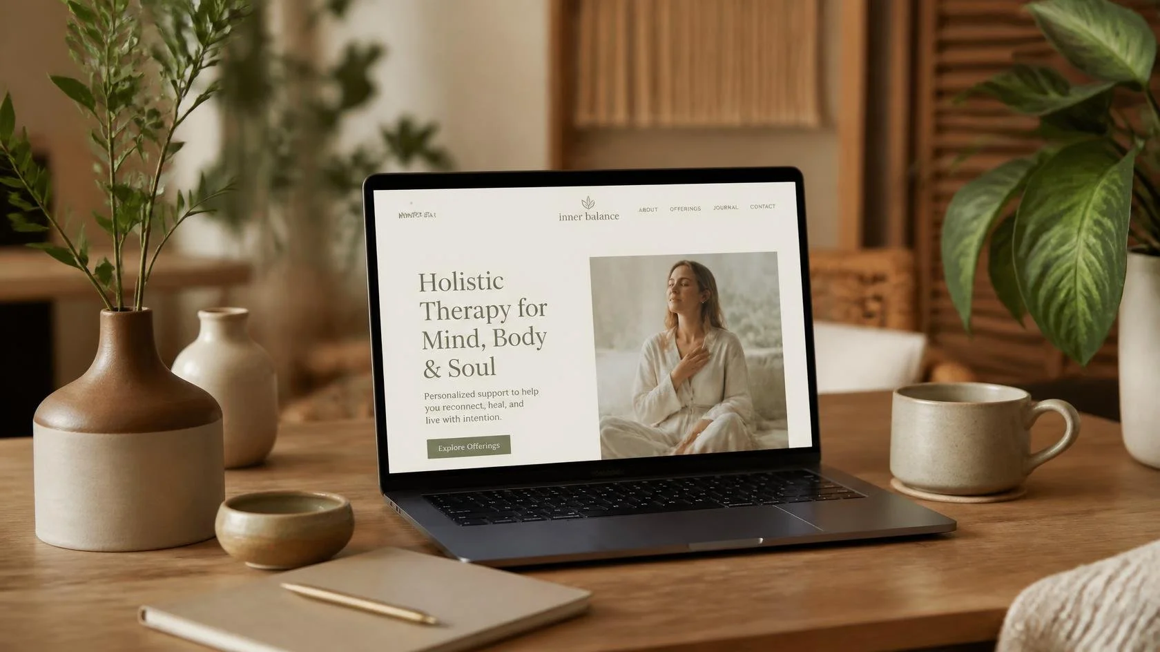
In this post I am breaking down what a well-structured wellness website actually needs to do before you invest a single dollar or hour into marketing. I am a web designer and digital strategist, not an SEO specialist or marketing consultant. What I share here comes from my own research and my experience as a wellness practitioner myself, which gives me a unique perspective on both sides of this conversation.
Introduction
I have watched this happen more than once.
A wellness solopreneur puts lots of energy into getting visible. She puts herself out there, telling people what she does, sharing her new website link, emailing her existing clients to let them know she has new exciting offerings. And after spending so much time and effort in marketing, she waits for her website to do the rest.
But people are not reaching out…
Another practitioner puts all her efforts into actively marketing. She creates her own podcasts, she creates a lot of social media content, and advertises her upcoming courses. Same story. People are landing on her website but not getting converted into clients.
Marketing did not fail these practitioners. We know people are actually visiting their websites. So, what could be going on here?
Let’s dive in.
What a Well-Designed Website Actually Does
First and foremost, think of your website as a guided experience to your visitors.
When new visitors land on your site for the first time, they don't know much, if anything, about you. If they found you through a search, a podcast, a referral, or a social media post they might be curious, but not committed. They are going to evaluate and decide whether you are worth their time and trust.
Your wellness website has one job in that moment: to guide them from "I just found you" to "I want to reach out," without them having to figure anything out on their own.
That journey has a natural sequence:
First, they need to know if they are in the right place. In the first few seconds, they need to understand what you do, who you serve, and whether that is for them. If they have to read three paragraphs, let alone pages to figure that out, they are already gone.
Then, they need to feel some sort of connection. How do they feel that connection? By feeling that you get it, that you understand what they are looking for, and that you might be exactly the person to help them get there. If there is some confusion or overwhelm they will close the tab.
Then, they need to trust you. Your story, your credentials, your client experiences, your warmth. All of it adds up to a quiet confidence that says: other people are benefiting from this person and I want that too.
Finally, they need a clear next step. You don’t need a dropdown menu with twelve options or modalities. One obvious, low-friction invitation to keep moving toward you.
Those practitioners we talked about at the beginning of this post are getting traffic. People are finding them and landing on their websites. But somewhere in that journey, from first click to reaching out, something is breaking down. The website is not guiding visitors through that natural sequence. And so they leave, not because they were not interested, but because the website did not give them a reason to stay.
How Your Website Guides Your Visitors
The journey I just described, from "I just found you" to "I want to reach out," does not happen by accident. It happens because the website is structured to guide the visitor through it, one page at a time, each one doing a specific job. If you get the pages right the journey takes care of itself.
A wellness practitioner's website does not need to be complicated to be effective. It normally just needs five pages:
Homepage. When you arrive at a website, this is what gives you the very first impression, (by the way, it is actually the most visited page on a website). If a homepage is doing its job right, you will immediately feel like you have arrived at the right place.
About Page. Once you have decided that you are at the right place, you might want to know more about this person, so you go to their About page. This is where the next decision actually happens, and it does not happen necessarily because of the list of credentials they are listing. It happens because you actually feel a human connection.
Services Page. Now you are interested. You want to know what this person actually offers and whether it is what you are looking for. This is where most wellness websites might lose you because they are being described in language you do not recognize. You are searching for help with something specific, and what you find instead are program names and modalities that mean nothing to you yet. If you cannot quickly connect what they offer to what you need, you move on.
A well-written service page might still make you move on if you are not looking for what they have to offer, and that is okay. You just were not the right fit for each other and the page is doing the job of filtering out mismatches.
Contact or Booking Page. You have done your research. You like what you see and you feel a connection. Now you are ready to take the next step. This is where a lot of wellness websites drop the ball at the finish line. If finding the booking button requires looking for a needle in a haystack, if the form is too long and makes you feel intimidated, or if it is unclear what happens after you submit, you will for sure hesitate. And hesitation at this stage is costly for them because they already got you… you already like them. A good contact or booking page makes it effortless. You know exactly what to do, what to expect, and what happens next.
Blog. Optional but powerful. More on this in another post.
If any of these pages are missing, unclear, or doing the wrong job, no amount of marketing will bring new wellness clients to your door.
Now let’s dive a little deeper.

Your Homepage Has One Job
Like I said before, the job of a homepage is to make the right person feel, within seconds, that they have arrived at the right place.
To do that, your wellness website homepage needs to answer three questions before a visitor even thinks about scrolling down the landing page:
Who is this for?
What do they do?
And what do I do next?
First let's talk about the hero section. The hero section is the visual area at the very top of your homepage before they scroll down. This is the first thing your visitor sees when they land on your website.
Here you have the headline. The headline is doing the heaviest lifting here. It is the first thing they read and the thing that determines whether they stay or go, so it needs to be crystal clear. It needs to speak to the person you are trying to reach, in the words they actually use, not the words you use to describe your work.
Below the headline, you normally have a subheadline that expands on who you help and how you help them.
You also need a strong image that feels like your work. This is known as the “hero image” and it’s doing significant emotional work. For wellness practitioners, it might reflect the experience of working with you. An image of how your clients feel during or after a session with you. Maybe calm, grounded, present, or relieved, so your image should evoke that feeling. A serene massage room, a moment of quiet reflection in nature. Because everyone knows a stock photo or an AI photo, I normally suggest investing in a brand photography session of real photos of your actual wellness space and the work you do.
Lastly, you should be inviting your visitors to take the next step and display a button with a clear call-to-action depending on what you want them to do, either schedule a consultation, or book now is what it’s often used.
What’s below the hero section?
Once a visitor decides to keep scrolling, they are looking for more reasons to stay. There are several other things that can be in this section but below are the most common ones.
You briefly introduce who you are.
You give them a snapshot of what you offer
You show them that others have trusted you and benefited from your work
You have a section for questions they may be asking themselves
Remind them one more time how to take that next step.
Your About Page Is Where the Decision Most Likely Happens
Some wellness practitioners have the temptation to treat their About page like a resume. They list their certifications, their training, their years of experience, and their professional affiliations. And while those things matter, they are not what makes a visitor decide to reach out.
What makes them decide is feeling like you understand them.
Contrary to common belief, your About page is not really about you. It is about them finding themselves in your story. When a visitor reads your About page, they are asking themselves if this person is someone who will get them. Your job is to answer that question before they even finish asking it.
That means you need to be leading with who you serve and what you understand about their experience before you talk about yourself. You can do that by sharing the part of your story that is relevant to them and by letting your personality come through, because at this stage they are not just evaluating your credentials, they are really just deciding if they like you.
A warm genuine photo helps here more than most practitioners realize. A photo that looks like you on a good day, approachable, present, and real.
Your credentials absolutely belong on this page. But they belong after the human connection has already been made, not before.
Your Services Page Speaks to Outcomes
When you trained in your wellness specialty, you learned a vocabulary, e.g. self-compassion, somatic experiencing, psychospiritual integration, myofascial release, polyvagal theory… That language makes complete sense to you and to your colleagues. But your potential client is not searching for those terms. Instead, they are searching for 1) what they want to feel, 2) what they want to stop feeling, or 3) what they want to be able to do that they cannot do right now.
Unless they are already familiar with a particular modality, they are not typing "somatic experiencing near me" into Google at 11pm. They are typing "why do I feel disconnected from my body" or "massage for chronic back pain Portland" or "therapist who specializes in trauma."
Your wellness services page needs to speak both languages. Lead with the outcome, the transformation, the result your client is moving toward. Then bring in your modality as the how, the method you use to get them there, and what makes you different from other practitioners.
You want to keep it as simple as possible by having one clear description per service. 1) What it is, 2) who it is for, and 3) what they can expect.
How to Contact You
Your homepage made them feel welcome. Your About page made them feel connected. Your services page made them feel understood. And now they are ready to take the next step.
This is not the moment to make them do some guesswork.
We need to make sure the booking button is easy to find and not buried somewhere. And once they submit, tell them exactly what happens next. A confirmation message with clear next steps goes a long way.
We might think that providing several ways to contact you is the way to go. But you need to make it easier on them and on yourself by providing either a contact form or a phone number or an email address or a scheduler. Pick your primary pathway and make it obvious to avoid making them overwhelmed with choices.
If you are providing a contact form, give them a brief explanation of what happens next. Something as simple as "I will get back to you within 24 hours to schedule your free consultation". Also ask for as few fields as possible. Name, email, and maybe one question about what they are looking for. That is enough to start a conversation. You can gather the rest later!
If you are using a scheduler, make sure your booking button is visible on every single page of your website. This is not because you are being pushy but because you never know which page is going to be the one that tips them over into ready.

The Trust Layer
There is a layer that runs quietly underneath everything we’ve talked about so far. It is not a page or a section of a page. It shows up everywhere, in small moments, and it is what turns an interested visitor into someone who actually reaches out.
That layer is trust.
Trust is built before a visitor ever contacts you. By the time they pick up the phone or fill out your form, they have already decided they are going to trust you in this first step. Your job is to make sure the signals are there to support that decision.
Here is what builds trust on a wellness website:
A genuine photo of you. Not a stock photo or a corporate headshot. A photo that looks like you on a good day, warm, inviting, present, and real.
Client testimonials. Add a place for client testimonials on your homepage, near your services and close to your booking button where the decision is actually happening. A few sentences from a real client who describes their experience in their own words is worth more than any headline you could write.
Your credentials, in the right place. After the human connection has been made, you can briefly mention your training, certifications, and relevant experience that tells them you actually know what you do.
Consistency. Your photos, your colors, your tone, your voice. When everything feels cohesive, visitors relax. Inconsistency, even subtle inconsistency, creates a quiet unease that is hard to name but easy to feel.
A clear privacy or HIPAA note, if relevant. For wellness practitioners collecting any kind of personal information, a simple reassuring line about how you handle client data removes a barrier that many visitors do not even realize they have.
Everything we have covered in this post, your pages, your visitor journey, your trust signals, this is your wellness website foundation. Now that it is solid, you can market with confidence. Knowing that when someone finds you, whether through a referral, a directory, a podcast, or a search, your website is now ready to do its job.
That is the difference between marketing into a leaky bucket and marketing into something that holds.
Conclusion
Building a wellness practice takes courage. Putting yourself out there, telling people what you do, showing up consistently, that takes real commitment. You deserve a website that honors that effort and works as hard as you do.
Your website is not just a digital brochure. It is the foundation everything else stands on. Your marketing, your referrals, your reputation, all of it eventually leads someone back to your website. And when they get there, your website either holds the door open or lets it close quietly behind them.
The good news is that getting this right does not require starting over or spending a fortune. It requires clarity, structure, and a genuine understanding of who you are trying to reach and what they need to feel before they reach out.
You already have the work. Now let's make sure your website shows it.
Ready to Take a Look at Your Website?
If you read this post and started mentally checking boxes, and leaving some unchecked, that is a good sign. It means you know exactly what needs attention.
Book a free 20-minute consultation and let's talk about where your wellness practice is headed and what your website needs to do to get you there.

About the Author
Veronica Diaz is the founder of Bloom Digital Design, a boutique Squarespace web design and digital strategy studio serving wellness and mental health practitioners building independent practices. She holds a 200-hour yoga teaching certification and training in mindfulness and self-compassion for children and caregivers. She has a heart for wellness practitioners and therapists because those people change the world and she built Bloom Digital Design to be part of that ripple. She relocated from Alabama to Portland, OR in the summer of 2026.